
Racing Bar Charts
TL;DR
Data can often change across time and these changes can provide meaningful insight. Displaying these changes can be challenging in a static visualisation due to the immense amount of data that may need to be included. We will walk through how to create a few static visualisations of data across time, and then how we can animate a visualisation using gganimate.
Static plots
For data, we will use the now classic GapMinder dataset which contains data on life expectancy, population and GDP per capita for a wide range of countries since the year 1952. We will begin by making a static plot of life expectancy across time. Let’s first look at a single country, the United Kingdom. Before going further, I would like to thank Gina Reynolds for her presentation which gives an excellent tutorial on how to create racing bar charts. Her presentation can be found at: https://evamaerey.github.io/little_flipbooks_library/racing_bars/racing_barcharts.html#1.
library(gapminder)
library(tidyverse)
theme_set(theme_light())

gapminder %>%
  filter(country == "United Kingdom") %>%
  ggplot(aes(year, lifeExp)) +
  geom_line() +
  xlab("Year") +
  ylab("Life expectancy at birth (years)")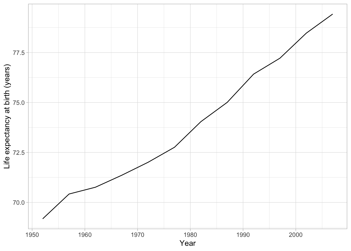
Figure 1: Basic line chart showing the change in life expectancy since 1954 in the United Kingdom
This visualisation is informative, life expectancy has increased in the United Kingdom over the last 60 years. It is, however, exceedingly dull!! Further, we would need to create one of these graphs for each country to see the trends across the entire dataset. Instead of this, we can add the other countries to the visualisation above using the color parameter and filtering to five countries rather than one.
gapminder %>%
  filter(country == "United Kingdom" | country == "United States" | country == "Malaysia" | country == "India" | country == "France") %>%
  ggplot(aes(year, lifeExp, color = country)) +
  geom_line() +
  xlab("Year") +
  ylab("Life expectancy at birth (years)")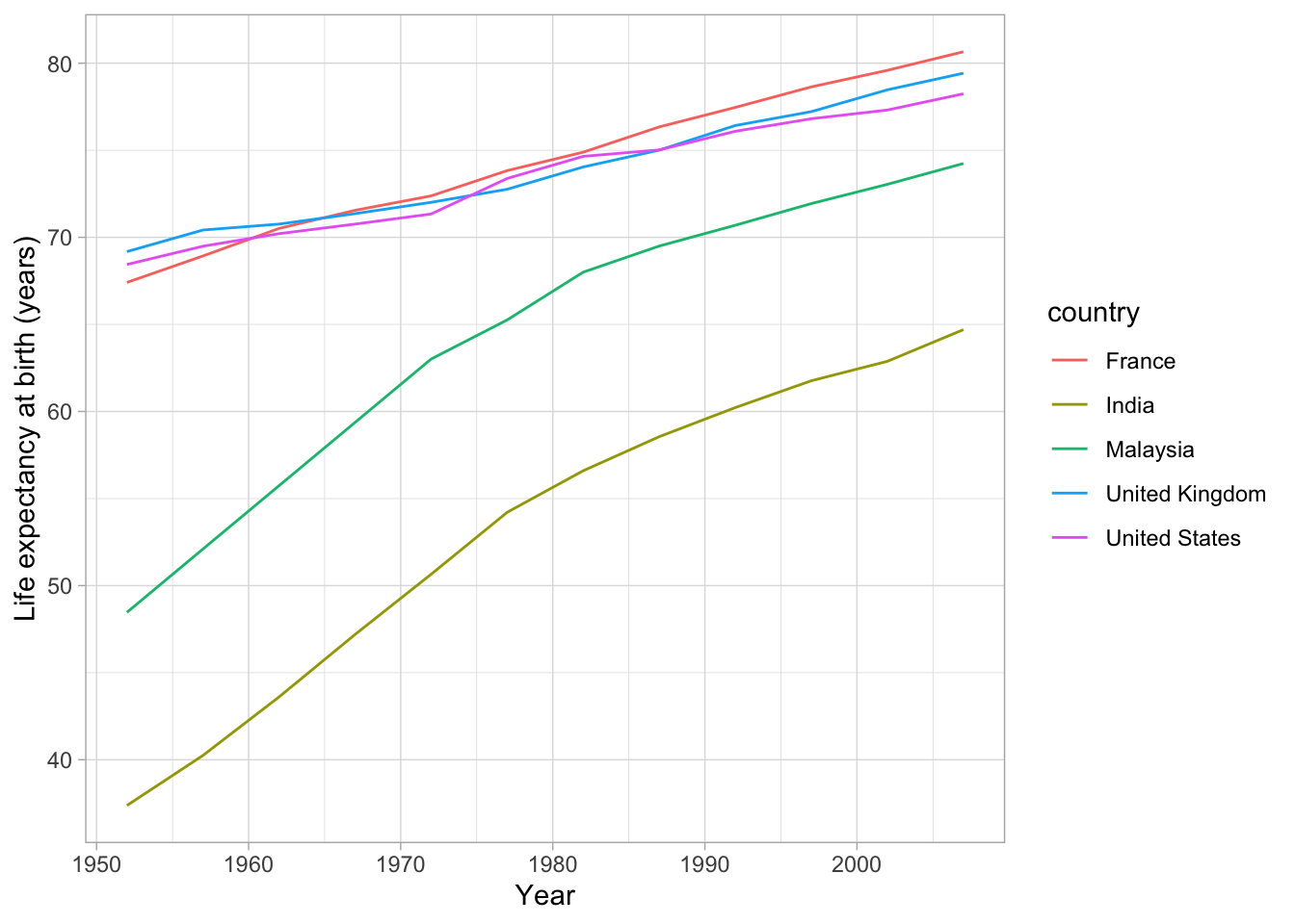
Figure 2: Multiple line graph showing the life exectancy of five countries since 1954
This visualisation is more interesting. We can see that the United States, United Kingdom and France follow a similar pattern whilst Malaysia shows a rapid increase before starting to taper off. India shows the same rapid increase but with less sign of flattening. However, this visualisation is still relatively boring and struggles to show large amounts of data without the lines becoming crossed over and difficult to interpret. We could use a different visualisation to showcase our data, the racing bar chart.
Racing bar charts
Before creating a racing bar chart, lets examine a static plot for comparison. For this graphic, we will use the 20 countries with the lowest life expectancy each five years to make the graphic more interesting.
gapminder %>%
  group_by(year) %>%
  arrange(year, lifeExp) %>%
  mutate(rank = 1:n()) %>%
  filter(rank <= 20) %>%
  filter(year == "1982") %>%
  ggplot(aes(reorder(country, lifeExp), lifeExp,  fill = country)) +
  geom_col() +
  coord_flip() +
  theme(legend.position = "none") +
  xlab("") +
  ylab("Life expectancy at birth (years)")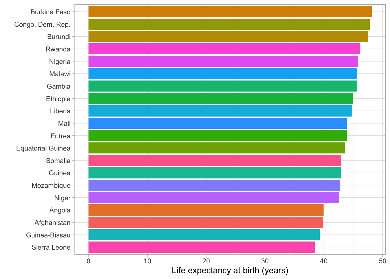
Figure 3: Bar plot showing the 20 countries with the lowest life expectancy in 1982
In this visualisation we can see the difference between countries very precisely at a set time point, however we have now removed all information regarding change over time. To combine both of these forms of data, we can animate the bar chart.
library(gganimate)
static_plot <- gapminder %>%
  group_by(year) %>%
  arrange(year, lifeExp) %>%
  mutate(rank = 1:n()) %>%
  filter(rank <= 20) %>%
  ggplot() +
  aes(xmin = 0 ,
      xmax = lifeExp) +
  aes(ymin = rank - .45,
      ymax = rank + .45,
      y = rank) +
  facet_wrap(~ year) +
  geom_rect(alpha = .7) +
  aes(fill = country) +
  geom_text(colour = "black",
            hjust = "right",
            aes(label = country),
            x = -2,
            size = 4) +
  geom_text(colour = "black",
            hjust = "right",
            aes(x = lifeExp, label = round(lifeExp, digits = 2)),
            size = 4) +
  scale_y_reverse() +
  guides(colour = FALSE, fill = FALSE)

static_plot +
  facet_null() +
  scale_x_continuous(
    limits = c(-20, 60),
    name = "Life Expectancy") +
  geom_text(x =  50, y = -2,
            family = "Times",
            aes(label = as.character(year)),
            size = 12, col = "black") +
  aes(group = country) +
  gganimate::transition_states(year, transition_length = 1, state_length = 1) +
  ease_aes("cubic-in-out")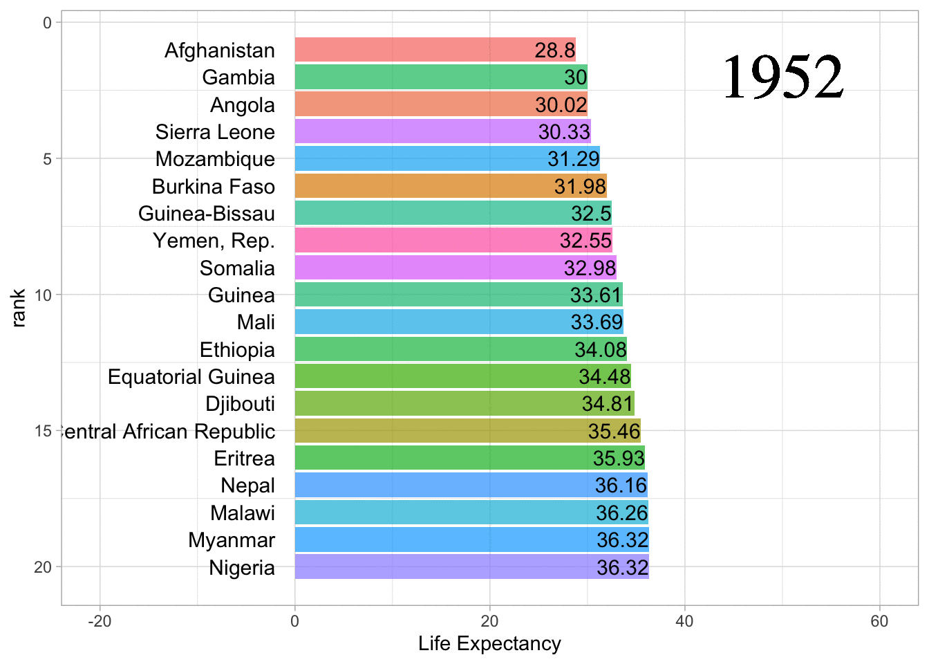
Figure 4: Racing bar chart of life expectancy from the 20 lowest countries
This code warrants a little explaining. Let’s take it line by line. Firstly, we take the GapMinder dataset and group it by year before arranging the countries by their life expectancy. Next, we mutate a rank for each country from 1 to the number of countries in the dataset. Then, we filter each year to only contain the countries with the lowest ranks (lowest life expectancy). Our data is now ready to be graphed.
We start by creating a ggplot2 object, then we set the x and y limits using the aesthetic argument. Next, we facet wrap the ggplot2 object by year, creating a separate plot for each year data were collected. Then we use geom_rect to create the bars and set the colour of these bars to the country data was collected in. The first geom_text expression adds a country label for each bar whilst the second geom_text adds a label of the life expectancy to each bar. We then reverse the Y axis and then set the colour and fill to false in the guides argument. This creates a static plot which is now ready to be animated.
To animate the plot, we start by using the facet_null function to remove the facets from the static plot to make it a single graph. We then set the X axis limits and names so they are consistent across each year. We then use geom_text to add a label to the graph to show which year is currently being displayed. Finally, we set the group argument to country and then call transition_states from gganimate to animate the graph. We then call the ease_aes to set how the animation animates each bar.
Phew!! Not the simplest graph to make but once you understand the basic pattern it is easy to apply a similar code structure to a wide range of datasets. You could even consider putting this code into a function if you are making many of these types of graphs.
Higher resolution data
Whilst I believe the above visualisation is both interesting and informative, the five year gaps in the data make the animation rather jumpy. We can achieve a smoother transition using data collected at a higher resolution. To illustrate this we can use a dataset that looks at the number of medals each country has won during the modern summer olympics.
This data set was found on Kaggle at: https://www.kaggle.com/the-guardian/olympic-games?select=summer.csv
To start the analysis, we read in the medals and dictionary dataset. We then join these datasets using a full join function so we can replace the country codes found in the medals dataset with the country name.
medals <- read.csv("/Users/jonahthomas/R_projects/academic_blog/content/english/post/2021-08-09-racing-bar-charts/summer.csv")
dictionary <- read.csv("/Users/jonahthomas/R_projects/academic_blog/content/english/post/2021-08-09-racing-bar-charts/dictionary.csv")

medals <- full_join(medals, dictionary[,1:2], by = c("Country" = "Code")) %>%
  mutate(
    Country = Country.y
  )
Next, we assign a value of one to all the medals rather than the gold, silver and bronze that originally populated the column. We then sum this data across country and year before generating a cumulative summary across just the country grouping. Finally, we remove NA’s from the dataset.
medals <- medals %>%
  mutate(
    Medal = 1
  ) %>%
  group_by(Country, Year) %>%
  summarise(
    count = sum(Medal, na.rm = TRUE)
  ) %>%
  group_by(Country) %>%
  mutate(
    count = cumsum(count)
  ) %>%
  na.omit()
We then create a static faceted plot with the data from each summer Olympic games.
static_plot_3 <- medals %>%
  group_by(Year) %>%
  arrange(Year, -count) %>%
  mutate(rank = 1:n()) %>%
  filter(rank <= 20) %>%
  ggplot() +
  aes(xmin = 0,
      xmax = count) +
  aes(ymin = rank - .45,
      ymax = rank + .45,
      y = rank) +
  facet_wrap(~ Year) +
  geom_rect(alpha = .7) +
  aes(fill = Country) +
  geom_text(colour = "black",
            hjust = "right",
            aes(label = Country),
            x = -50,
            size = 4) +
  geom_text(colour = "black",
            hjust = "right",
            aes(x = count + 200, label = round(count, digits = 2)),
            size = 4) +
  scale_y_reverse() +
  guides(colour = FALSE, fill = FALSE)
Finally, we animate this plot. You will notice we have changed some parameters from the first graph due to the differences in scale between both visualisations.
static_plot_3 +
  facet_null() +
  scale_x_continuous(
    limits = c(-1000, 5000),
    name = "Medals") +
  geom_text(x =  4000, y = -15,
            family = "Times",
            aes(label = as.character(Year)),
            size = 12, col = "black") +
  aes(group = Country) +
  gganimate::transition_states(Year, transition_length = 1, state_length = 10) +
  ease_aes("cubic-in-out")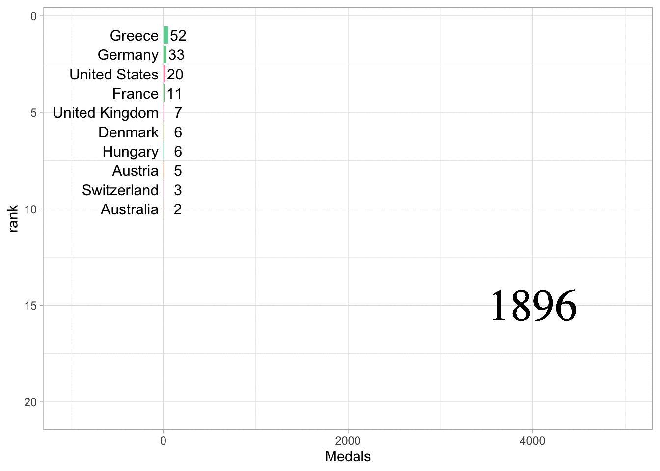
Figure 5: Racing bar chart of countries medal haul from each summer Olympic games
Alternatives
Whilst I think there are many situations where a racing bar chart is a useful and eye-catching visualisation to show how data changes or progresses across time. However, I feel it is worth mentioning gganimate is also able to animate line charts. Lets take a look at the baby names dataset from the babynames package. We will filter down to three male names and look at their popularity over time. Then we will create a line graph and animate it using the transition_reveal function from gganimate.
library(babynames)
library(hrbrthemes)
babynames::babynames %>%
  filter(name %in% c("Frank", "George", "Henry")) %>%
  filter(sex == "M") %>%
  ggplot(aes(x = year, y = n, group = name, color = name)) +
  geom_line() +
  geom_point() +
  transition_reveal(year)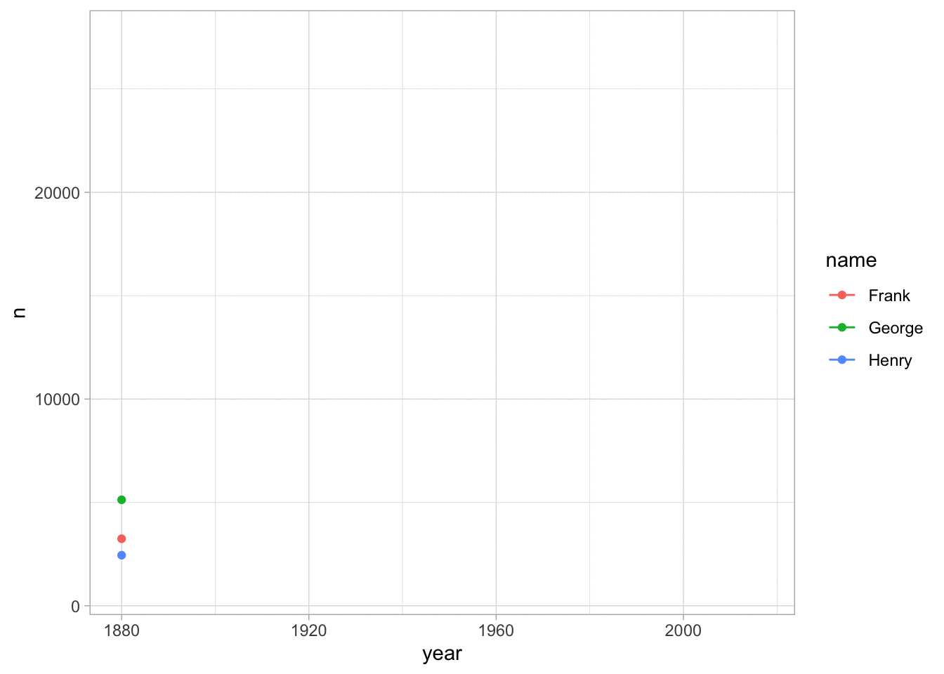
Figure 6: Animated line chart showing changes in baby name preferences over time
Conclusions
We first looked at some basic static plots to show change across time. We then created our racing bar chart using two datasets and the gganimate package. Finally, we looked at animating a line chart as an alternative to the racing bar chart.