
Analysing Whisky Rating Data
TL;DR
There are a number of different flavours that can be found in whiskys. In this analysis we analyse which flavours commonly appear together using a network graph. Then we perform cluster analysis and plot these clusters on a map to determine if geogrphic location has an impact on the flavours of whiskys.
Introduction
We are going to analyse some whiskey rating data. This data comes from 86 distilleries in Scotland. The structure for the data set is shown below. We can see that we have an ID column, the distillery name, then a whole bunch ratings of different flavour aspects of the whiskey followed by some location data about where the distillery is located.
whisky <- read.csv("/Users/jonahthomas/R_projects/personal_blog/content/post/2021-03-05-analysing-whisky-rating-data/whisky.csv")
whisky$Latitude <- as.numeric(whisky$Latitude)
whisky$Longitude <- as.numeric(whisky$Longitude)
str(whisky)
## 'data.frame': 86 obs. of 17 variables:
## $ RowID : int 1 2 3 4 5 6 7 8 9 10 ...
## $ Distillery: chr "Aberfeldy" "Aberlour" "AnCnoc" "Ardbeg" ...
## $ Body : int 2 3 1 4 2 2 0 2 2 2 ...
## $ Sweetness : int 2 3 3 1 2 3 2 3 2 3 ...
## $ Smoky : int 2 1 2 4 2 1 0 1 1 2 ...
## $ Medicinal : int 0 0 0 4 0 1 0 0 0 1 ...
## $ Tobacco : int 0 0 0 0 0 0 0 0 0 0 ...
## $ Honey : int 2 4 2 0 1 1 1 2 1 0 ...
## $ Spicy : int 1 3 0 2 1 1 1 1 0 2 ...
## $ Winey : int 2 2 0 0 1 1 0 2 0 0 ...
## $ Nutty : int 2 2 2 1 2 0 2 2 2 2 ...
## $ Malty : int 2 3 2 2 3 1 2 2 2 1 ...
## $ Fruity : int 2 3 3 1 1 1 3 2 2 2 ...
## $ Floral : int 2 2 2 0 1 2 3 1 2 1 ...
## $ Postcode : chr "\tPH15 2EB" "\tAB38 9PJ" "\tAB5 5LI" "\tPA42 7EB" ...
## $ Latitude : num 286580 326340 352960 141560 355350 ...
## $ Longitude : num 749680 842570 839320 646220 829140 ...As we have some location data, lets start by plotting the distilleries on a map of Scotland.
uk_map <- map_data("world") %>%
  filter(region == "UK")

whisky.coord <- data.frame(whisky$Latitude, whisky$Longitude)
coordinates(whisky.coord) <- ~whisky.Latitude + whisky.Longitude
proj4string(whisky.coord) <- CRS("+init=epsg:27700")
whisky.coord <- spTransform(whisky.coord, CRS("+init=epsg:4326"))

whisky_map <- data.frame(Distillery = whisky$Distillery,
                         lat = whisky.coord$whisky.Latitude,
                         long = whisky.coord$whisky.Longitude)

uk_map %>%
  filter(subregion == "Scotland") %>%
  ggplot() +
  geom_map(map = uk_map,
           aes(x = long, y = lat, map_id = region),
           fill="white", colour = "black", show.legend = FALSE) +
  coord_map() +
  geom_point(data = whisky_map, aes(x = lat, y = long, color = "red"))+
  theme_void()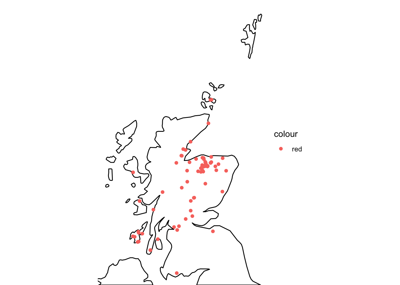
Figure 1: Map of Scotland showing the location of the whisky distilleries.
We can see in this map the distilleries are relatively spread out across Scotland. There appears to be a large number of distilleries on a small island off the East coast of Scotland (location) along with a cluster towards the North East. Now we have visualised this data, lets start to look at the ratings data. To do this we will create a ridge plot to see the distribution of the ratings in each category. To plot this graph, we need to do some data manipulation.
How are whisky flavour characteristics inter-related
We will use the pivot longer function to create a tidy dataframe with the flavour characteristic in one column and the value for that characteristic in another. One we have the data in this structure, we can use the ggplot2 and ggridges package to create a ridge plot for each flavour metric.
whisky_metrics <- whisky %>%
  select(RowID:Floral) %>%
  pivot_longer(Body:Floral, names_to = "metric", values_to = "value")

head(whisky_metrics)
## # A tibble: 6 × 4
## RowID Distillery metric value
## <int> <chr> <chr> <int>
## 1 1 Aberfeldy Body 2
## 2 1 Aberfeldy Sweetness 2
## 3 1 Aberfeldy Smoky 2
## 4 1 Aberfeldy Medicinal 0
## 5 1 Aberfeldy Tobacco 0
## 6 1 Aberfeldy Honey 2whisky_metrics %>%
mutate(metric = fct_reorder(metric, value)) %>%
ggplot(aes(value, metric)) +
geom_density_ridges() +
xlim(0, 4)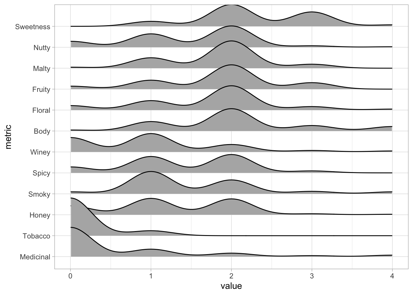
Figure 2: Ridge plot showing the distribution of ratings for each flavour characteristics.
From this ridge plot, we can see that very few whiskeys get a value greater than zero for medicinal or tobacco flavour. A lot of whiskeys appear to be awarded a value of 1 or 2 for the remaining flavour characteristics. However, there is a small peak at the value 3 for sweetness suggesting some whiskeys may be sweeter than others. We can also see that very few whiskeys receive a high flavour score for honey, smoky, spicy or winey suggesting very few if any of the whiskeys in this datasets exhibit any of these flavours strongly.
Now we have an idea of the distribution of the flavour characterisitcs, lets see if there are any flavour combinations that often appear together. To do this, we can create a correlation matrix. This will tell us how strongly correlated one flavour characteristic is with others. To do this we can use the cor function from base R. Whilst we can show this data in a table, we can use the psych and corrplot packages to visualise this data in a more interesting way.
correlations <- cor(whisky[, 3:14])
whisky_metrics %>%
  pairwise_cor(metric, RowID, value, sort = TRUE) %>%
  head() %>%
  kable(caption = "Pairwise correlation of each flavour characterisitc.") %>%
kable_styling(bootstrap_options = "striped")| item1 | item2 | correlation |
|---|---|---|
| Medicinal | Smoky | 0.6860705 |
| Smoky | Medicinal | 0.6860705 |
| Smoky | Body | 0.5240316 |
| Body | Smoky | 0.5240316 |
| Tobacco | Medicinal | 0.4251056 |
| Medicinal | Tobacco | 0.4251056 |
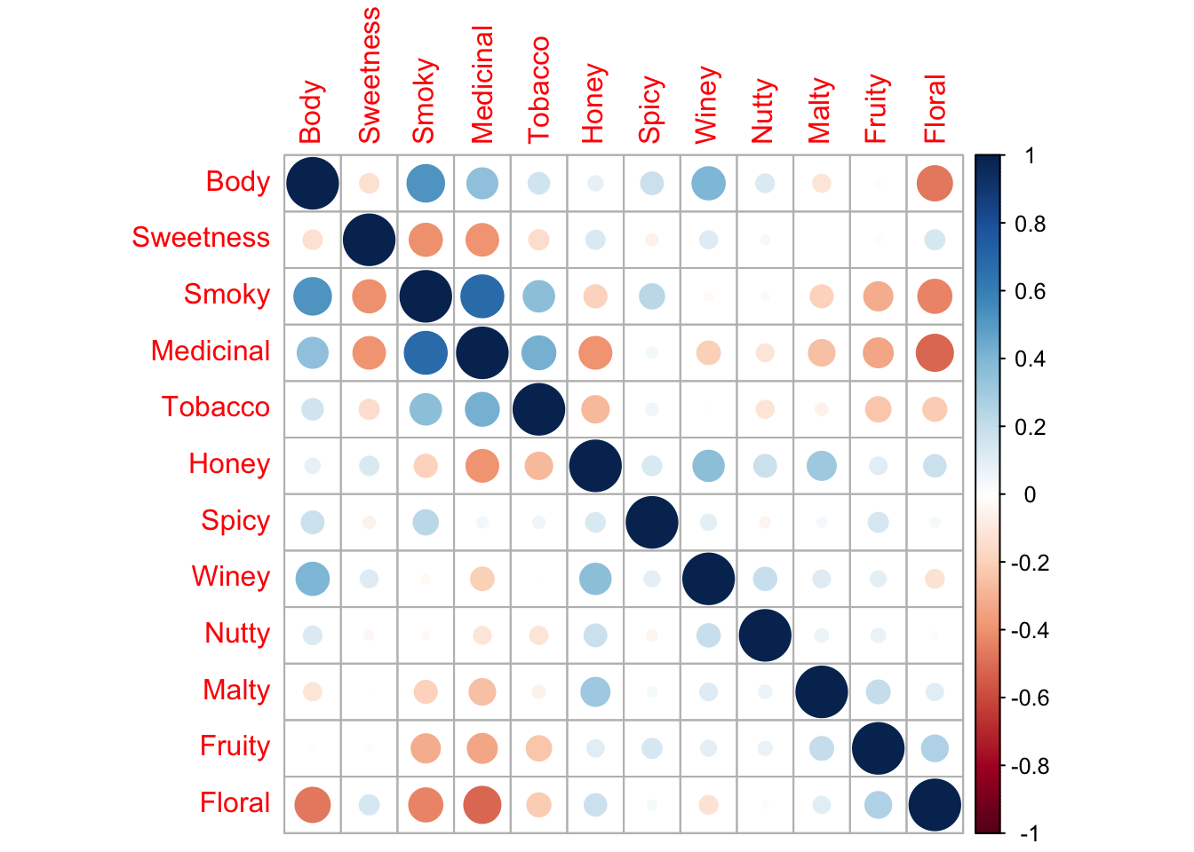
Figure 3: Correlation plots of each flavour characteristics from the corrplot package.
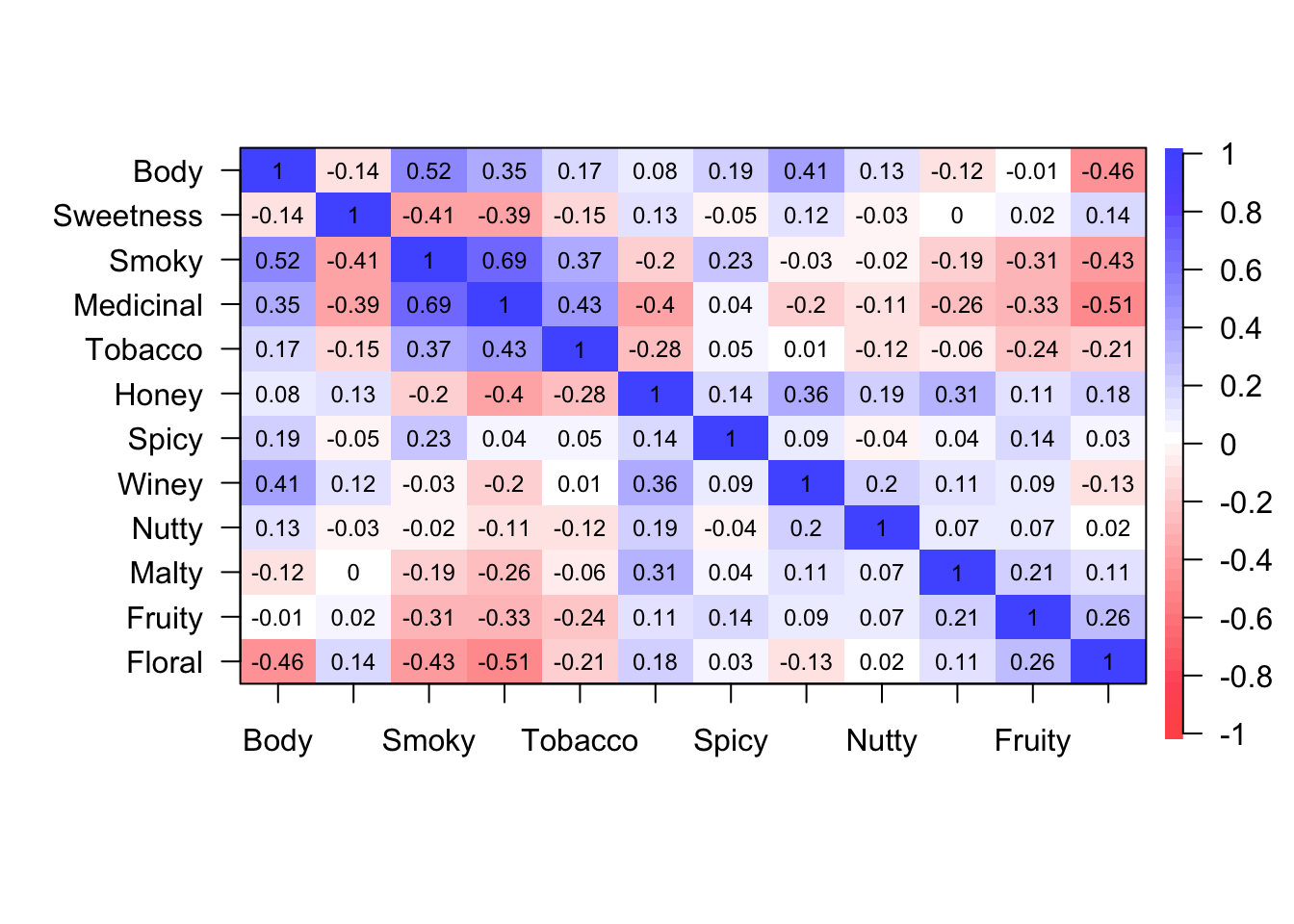
Figure 4: Correlation plot of each flavour characteristics from the psych package.
From these visualisation, we can see that some flavour characteristics often appear together whilst some very rarely if ever appear together. In this data, we can see that floral flavours are correlated with medicinal flavours and a strong body. On the other hand, malty and sweet flavours have no correlation whilst spicy and malty and winey and tobacco flavours are very weakly correlated with each other.
This suggests that some flavour combinations may appear together frequently whilst rarely appearing with other flavours. Therefore, it may be interesting to explore the relationship between the correlation with each flavour characteristic. To do this, we will use the pairwise correlation data to create a network plot. We will use the ggraph and igraph package to do this.
whisky_metrics %>%
  pairwise_cor(metric, RowID, value, sort = TRUE) %>%
  head(40) %>%
  graph_from_data_frame() %>%
  ggraph() +
  geom_edge_link(aes(edge_alpha = correlation)) +
  geom_node_point() +
  geom_node_text(aes(label = name), repel = TRUE)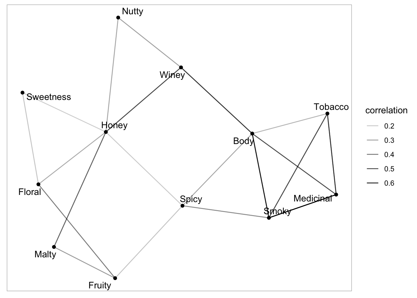
Figure 5: A network plot of the pairwise correlations between flavour characteristics.
This graph does not provide very clear groups of flavour characteristics. However, it is clear to see that smoky, medicinal, tobacco and body appear to form a distinct group. We can also see that flavour characteristics such as sweetness and nutty are only correlated with a few other flavours.
K means clustering
To get a better sense of whether there are groups in our data, we can employ a clustering approach to our data. Whilst many clustering methodologies exist, today we will use k mean cluster analysis. To do this, we first scale our dataset and then use the kmeans function in base R. Next, we can use the FactoExtra package to plot our cluster analysis. For this analysis, we set the k value to 3.
kmean_data <- scale(whisky[3:14])
whisky_kmeans <- kmeans(kmean_data, 3, nstart = 25)
whisky <- cbind(whisky, whisky_kmeans$cluster)
fviz_cluster(whisky_kmeans, data = whisky[, 3:14],
             geom = "point",
             ellipse.type = "convex")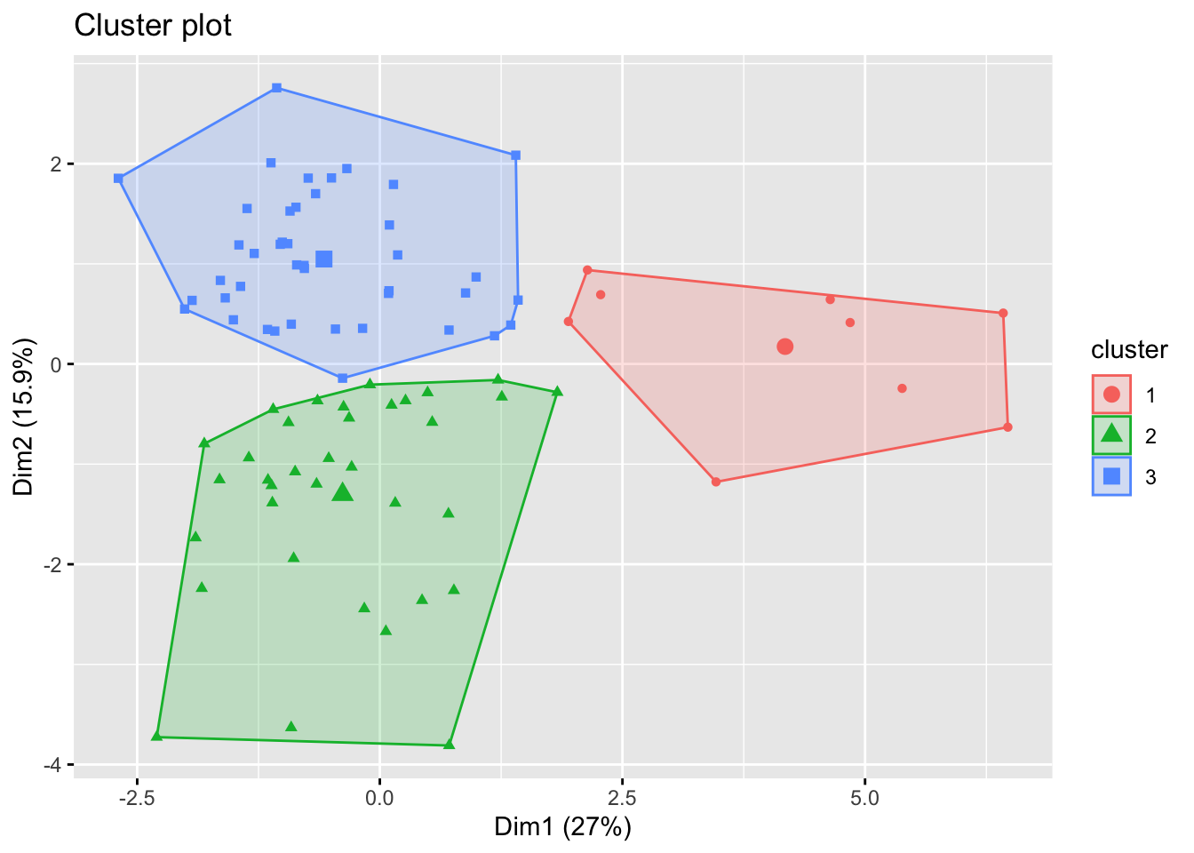
Figure 6: K mean cluster analysis.
From this graph, we can see that our whisky ratings appear to fall into three key clusters. Now we understand there may be three clusters in our data, we can explore how these clusters differ. To do this, we will create another ridge plot but this time we will use the facet wrap function in ggplot2 to create seperate plots for each cluster.
whisky_metrics_kmeans <- whisky %>%
  select(RowID:Floral, `whisky_kmeans$cluster`) %>%
  pivot_longer(Body:Floral, names_to = "metric", values_to = "value")

whisky_metrics_kmeans %>%
  mutate(metric = fct_reorder(metric, value)) %>%
  ggplot(aes(value, metric)) +
  geom_density_ridges() +
  xlim(0, 4) +
  facet_wrap(~`whisky_kmeans$cluster`)
From this visualisation, we can understand how our clusters differ. Cluster three appears to be whisky’s with higher medicinal and smoky flavour characteristics as well as a strong body. This cluster also appears to exhibit low honey, sweetness and floral flavours. Cluser one and two are slightly harder to distinguish which is logical considering their boundaries are close on the cluster plot. Both these clusters show very low medicinal and tobacco flavours. It appears that cluster two may be slightly sweeter whiskys with slightly higher floral flavours whilst cluster one whiskys have more honey and slightly higher winey flavours.
Now we have a better understanding of how our clusters differ, we could revisit our map of distilleries from earlier. We can now colour our distilleries by the cluster they are in allowing us to see whether the geographic location of the whisky distillery has an impact on the flavour of the whisky produced.
whisky_map_kmean <- data.frame(Distillery = whisky$Distillery,
                         lat = whisky.coord$whisky.Latitude,
                         long = whisky.coord$whisky.Longitude,
                         cluster = as.factor(whisky_kmeans$cluster))

uk_map %>%
  filter(subregion == "Scotland") %>%
  ggplot() +
  geom_map(map = uk_map,
           aes(x = long, y = lat, map_id = region),
           fill="white", colour = "black") +
  coord_map() +
  geom_point(data = whisky_map_kmean, aes(x = lat, y = long, color = cluster))+
  theme_void()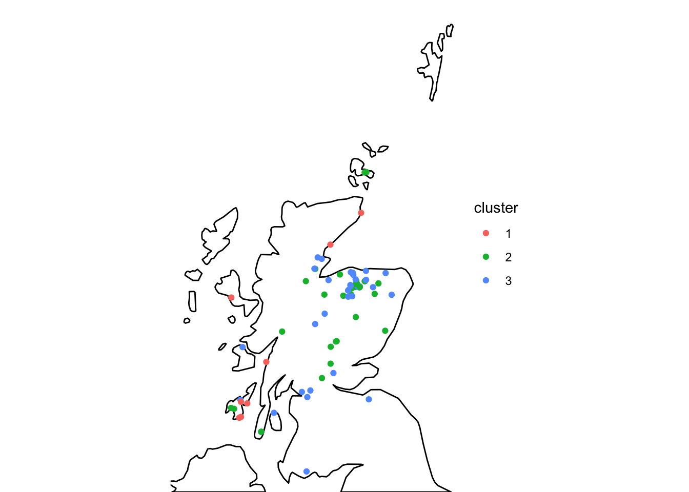
Figure 7: A map of Scotland with the distillery locations overlayed categorised by the distillery cluster.
Overall, this data shows that the geographic location of the whisky distillery does not have a large impact on the flavour of the whisky produced. However, we can see that all the distilleries from cluster three appear to be located on the coast. However, distilleries from other cluster are also located along the coast. This suggests that the geographic location of the distillery may have a small impact on the flavour of the whisky produced but other factors likely play a larger role.
Conclusion
From this data we can see that whiskys tend to share a group of flavour characteristics. From this information, we were able to generate clusters within the ratings data and then explore how these clusters differed based on their flavour characteristics. We then plotted this cluster data on a map to identify whether geographic lotion had an impact on whisky flavours.