
United States Covid 19 Data
TL;DR
R is a highly effective tool to manipulate and wrangle your data into a format that can then be represented on a map. Whenever a dataset contains some form of location information consider whether a map could be a useful method to show th relationships in your data.
Introduction
The COVID 19 pandemic has swept across the globe since it originated in 2019. Due to the contemporary nature of this global health concern, it seems appropriate to take a look at some of the data. To do this we will use a dataset from Kaggle that looks at COVID 19 data in US states. Whilst this data is helpful on its own, it would be more beneficial to be able to compare between states based on the number of cases per unit of population. In epidemiology, a value of occurrence per 1000 or 100000 is often used. To allow us to calculate this metric, we will also load in a dataset that shows the US population per state in 2019.
Once the data has been loaded in we need to do some manipulation. Firstly, we will only select the columns we need from the population dataset (namely states and the data from 2019). Then we will change the column names to something more relevant. Next, we will use the “state2abbr” function to change the state names to their abbreviation. This coerces NA values to any character that is not a state name so we will then omit these rows.
population_data <- population_data[, c(1,13)]
colnames(population_data) <- c("state", "pop")
population_data$state <- state2abbr(population_data$state)
population_data %>%
  na.omit() -> population_data
Now our population data is in a format we can use, lets move onto the COVID 19 dataset. Firstly, the data is a simple character string not a date format. To correct this, lets split the data using the “substr” function and referencing the character position in the string. We will seperate each of these values into a seperate column. Then we will combine all these columns back into a single date formatted column.
Data manipulation
tests <- tests %>%
  mutate(
    year = substr(date, 1, 4),
    month = substr(date, 5, 6),
    day = substr(date, 7, 8)
  ) %>%
  relocate(c("date", "year", "month", "day"))
tests$date <- as.Date(with(tests, paste(year, month, day,sep="-")), "%Y-%m-%d")
Now our data is in a formatted, we can graph the daily COVID case rates across the US. To do this, we can combine the tests and population datasets together using an inner join, then group by day and then calculate a daily case rate per 1000 population. This data can then be piped into ggplot2 and plotted as a line graph.
inner_join(tests, population_data) %>%
  group_by(date) %>%
  summarise(
    case_rate = (sum(positive, na.rm = TRUE)/sum(pop, na.rm = TRUE) * 1000)
  ) %>%
  ggplot() +
  geom_smooth(aes(date, case_rate), se = FALSE) +
  scale_x_date(date_breaks = "2 month") +
  labs(x = "Date", y = "Case rate") +
theme_classic() 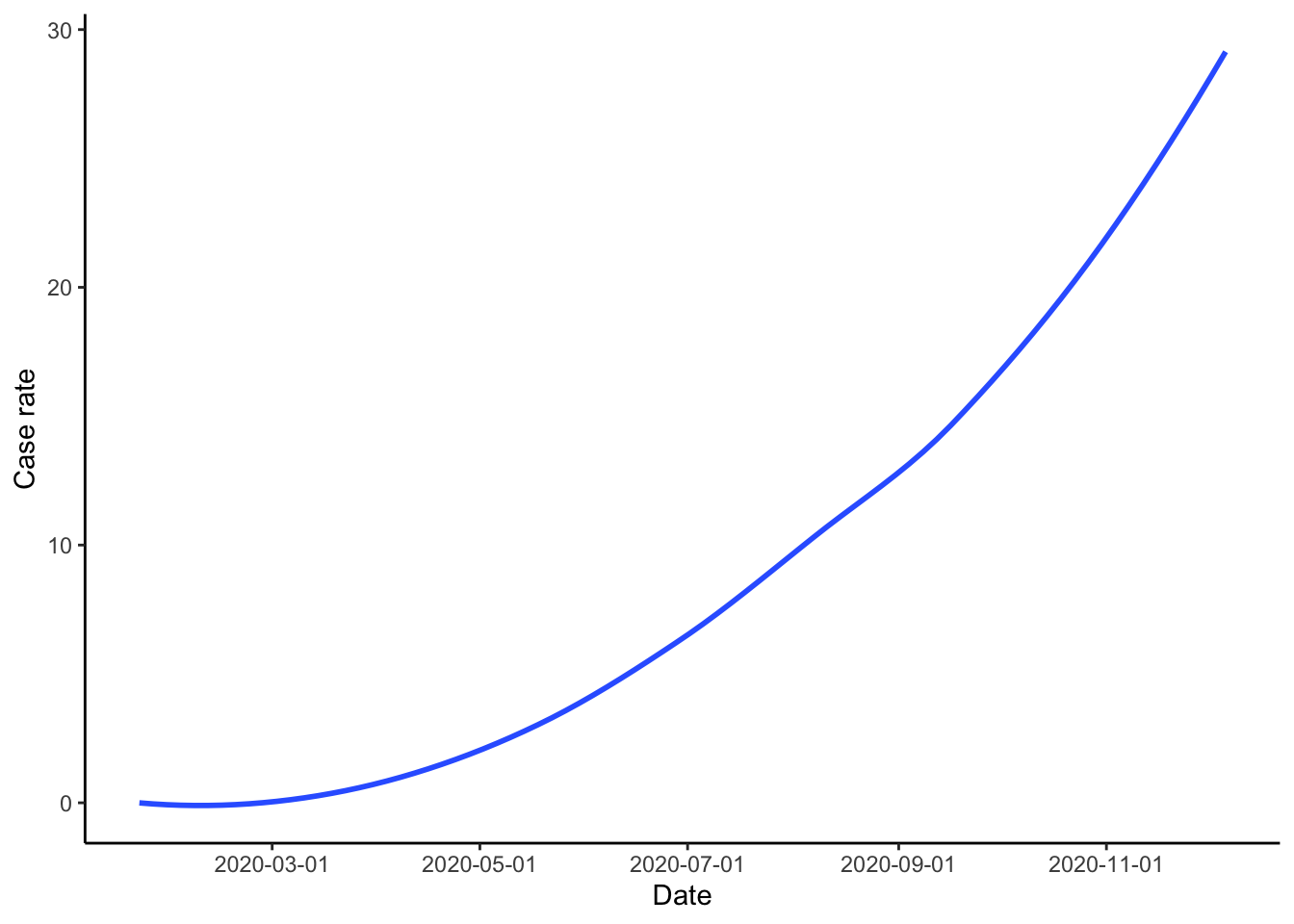
Figure 1: US COVID 19 cases.
From this graph we can see that COVID 19 cases remained at pretty much zero until around the middle of March. After this, the daily case rate per 1000 population increases. The most worrying part of the graph is the slight but still noticable increase in the speed of increase in the daily case rate from October onwards.
Whilst this graph shows the general trend across the US, if we wanted to look at the rates per state such a visualisation may not be ideal. The code below creates just such a graph. Whilst the central trends can be identified, the similarity in colours between the lines makes identification of a specific state challenging. Also, comparison between different states is next to impossible with the significant overlap.
inner_join(tests, population_data) %>%
  group_by(date, state) %>%
  summarise(
    case_rate = (sum(positive, na.rm = TRUE)/pop * 1000)
  ) %>%
  ggplot() +
  geom_smooth(aes(date, case_rate, group = state, color = state), se = FALSE) +
  labs(x = "Month", y = "Case rate") +
  theme_classic()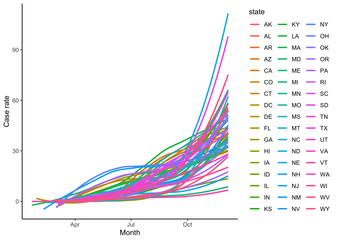
Figure 2: COVID 19 case rates for each US state.
Therefore, plotting the data on a map of the US may be a better option. To do this, we first need to bring in a dataset with the longitude and latitude coordinates to plot the United States and the state boundaries. To do this we will utilise the map data package from R.
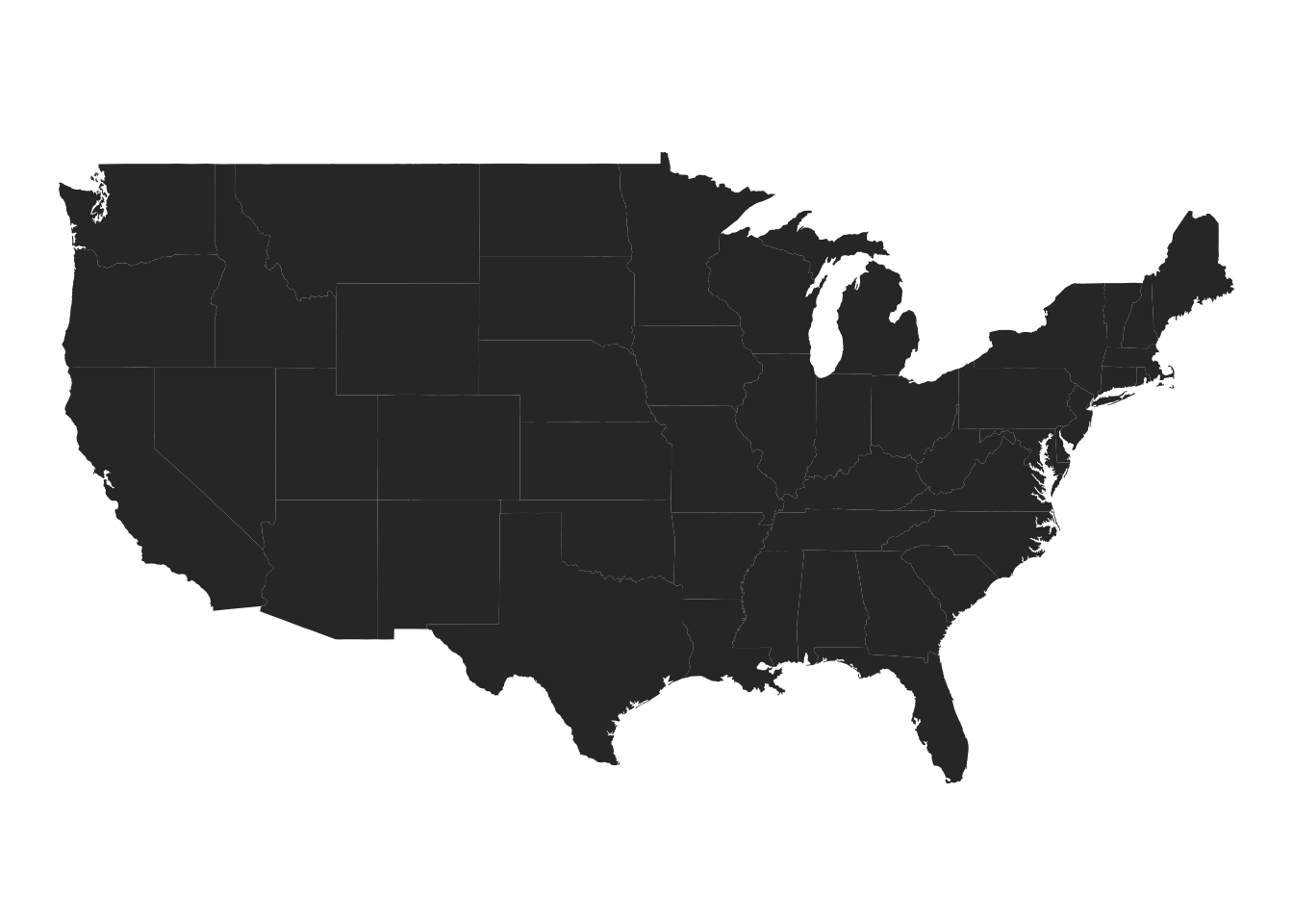
Figure 3: A map of the US with the state borders.
We can see that the code above produces a basic map of the US with the state boundaries. The next step is to add our COVID 19 case rate data to this map. To allow us to do this, we need to combine the map data above with the COVID 19 data. We will use the inner join function to join the map data, test
First we will create a case rate and death rate for the entire dataset for each state. To do this, we first combine the tests and population data and use these variables to create the case and death rate. We then join this data with the mainstates dataset so we can plot the data on a map. You may notice we have used a log function when creating the rates, this due to the case and death rates data being highly left skewed.
map_data <- tests %>%
  group_by(state) %>%
  summarise(
    case = sum(positive, na.rm = TRUE),
    death = sum(death, na.rm = TRUE)
  ) %>%
  inner_join(mainstates, by = c("state" = "region")) %>%
  inner_join(population_data) %>%
  mutate(
    case_rate = log((case/pop)*100000),
    death_rate = log((death/pop)*100000)
  )
Now we have created an appropriate dataset, we can use this in ggplot2. The only difference between this and our previous maps is we have set the fill function to either case or death rate.
ggplot(map_data, aes(x = long, y = lat, group = group, fill = case_rate)) +
  geom_polygon() +
  coord_map() +
  theme_void() +
  scale_fill_gradientn(colors = hcl.colors(10), limits = c(1,15))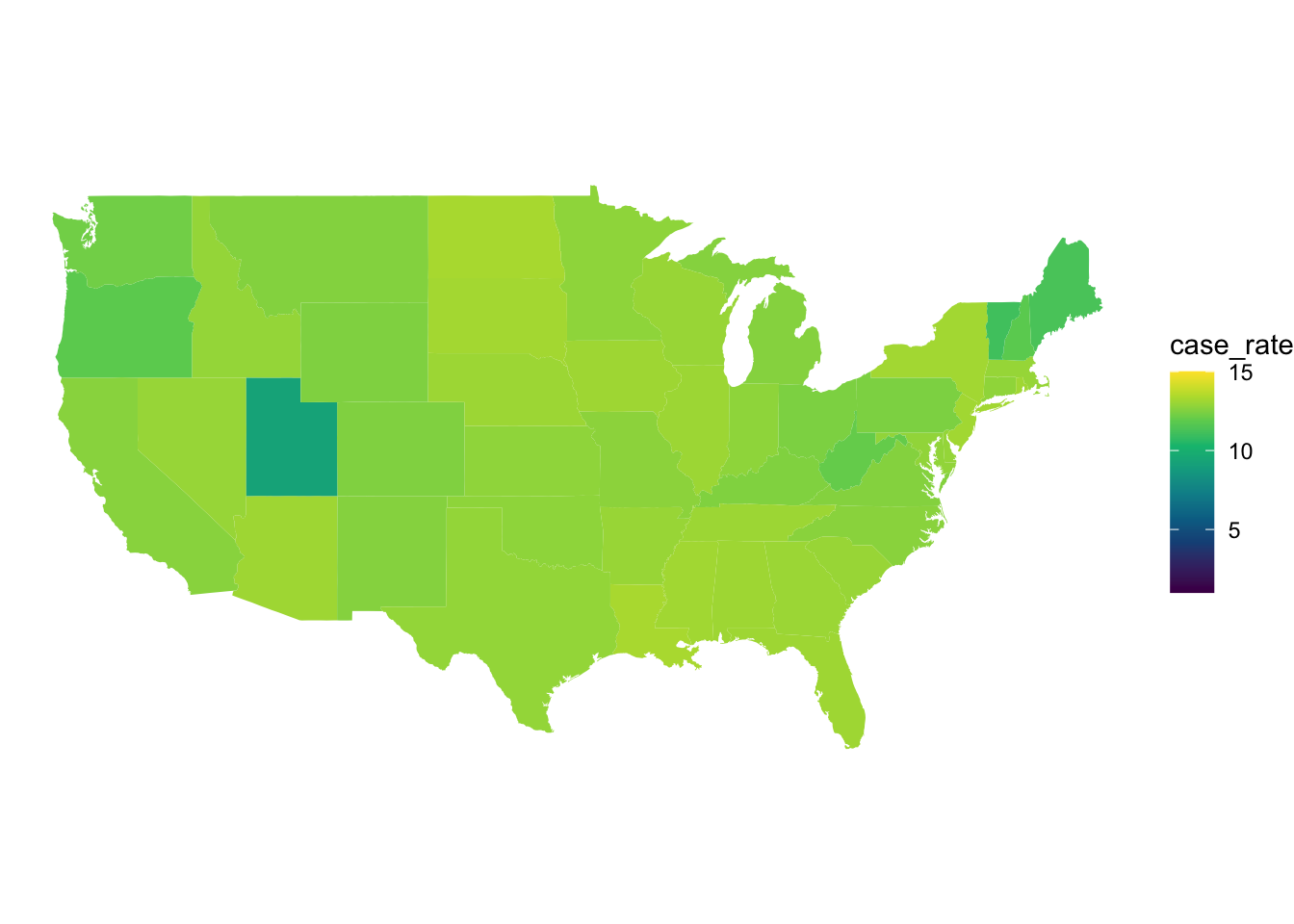
Figure 4: COVID 19 cases in each state shown on a map of the US.
ggplot(map_data, aes(x = long, y = lat, group = group, fill = death_rate)) +
  geom_polygon() +
  coord_map() +
  theme_void() +
  scale_fill_gradientn(colors = hcl.colors(10), limits = c(1,15))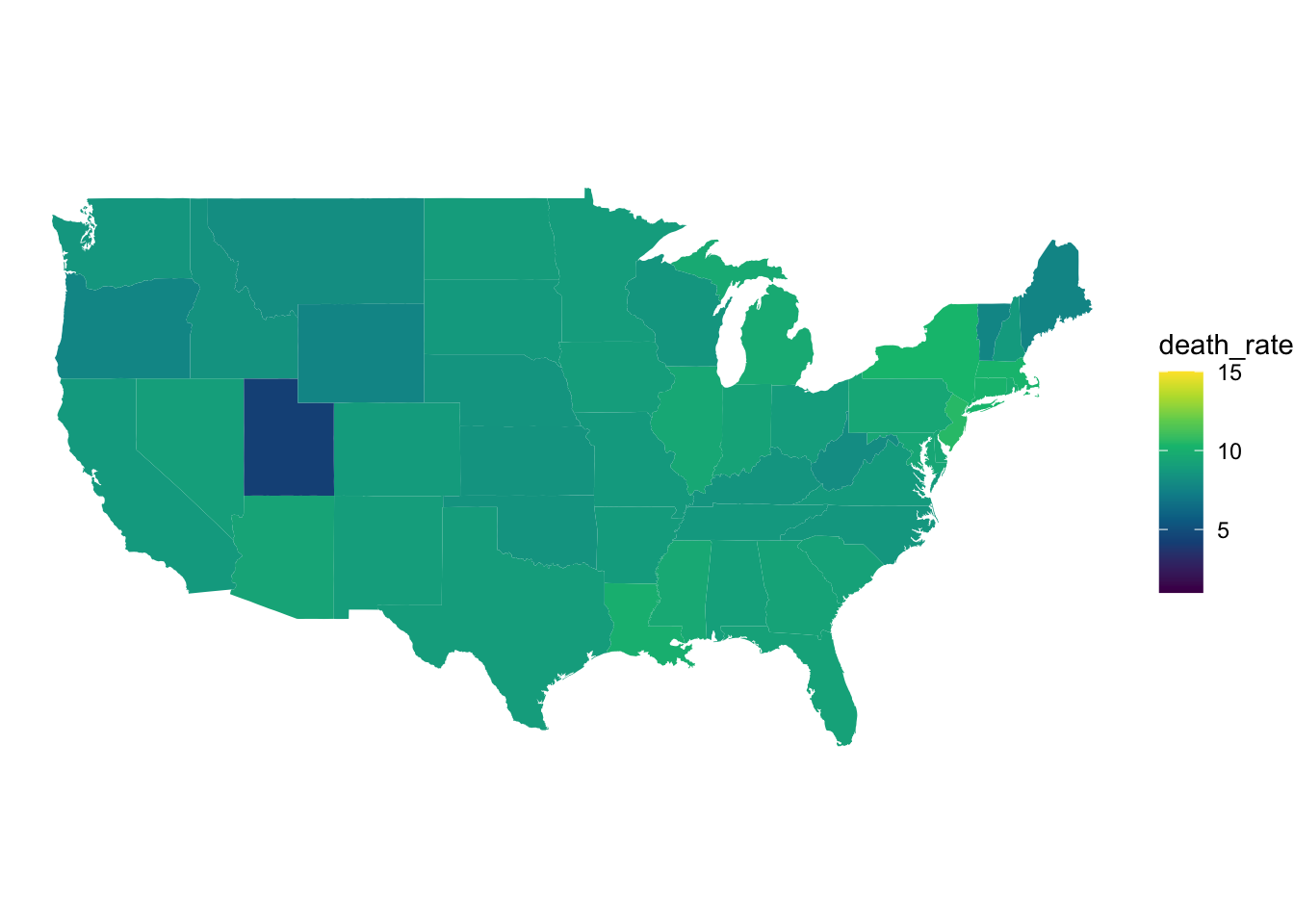
Figure 5: COVID 19 deaths in each state shown on a map of the US.
From these maps we can much more easily see the case and death rate in each state making comparison between each state. You may also notice we have set the scales to be the same across both maps. This is not neccessary but allows us to clearly see that case rates are significantly higher than death rates.
Now we have plotted the cases and death rates data for the entire dataset, lets finish by seeing how the rates have changed from the beginning of the pandemic to the last complete moth of data. In this dataset, we will look at the data from April and compare this to the November data. All the steps here are the same as above, except we filter the test data to only contan data from the relevant months.
april_data <- tests %>%
  group_by(state) %>%
  filter(month == "04") %>%
  summarise(
    case = sum(positive, na.rm = TRUE),
    death = sum(death, na.rm = TRUE)
  )

november_data <- tests %>%
  group_by(state) %>%
  filter(month == "11") %>%
  summarise(
    case = sum(positive, na.rm = TRUE),
    death = sum(death, na.rm = TRUE)
  )

april_data <- full_join(april_data, mainstates, by = c("state" = "region"))
april_data <- full_join(april_data, population_data)
november_data <- full_join(november_data, mainstates, by = c("state" = "region"))
november_data <- full_join(november_data, population_data)

april_data %>%
  mutate(
    case_rate = log((case/pop)*100000),
    death_rate = log((death/pop)*100000)
  ) -> april_data

november_data %>%
  mutate(
    case_rate = log((case/pop)*100000),
    death_rate = log((death/pop)*100000)
) -> november_dataggplot(april_data, aes(x = long, y = lat, group = group, fill = case_rate)) +
geom_polygon() +
coord_map() +
theme_void() +
scale_fill_gradientn(colors = hcl.colors(10), limits = c(1,15))
Figure 6: COVID 19 case rates in April.
ggplot(november_data, aes(x = long, y = lat, group = group, fill = case_rate)) +
  geom_polygon() +
  coord_map() +
  theme_void() +
  scale_fill_gradientn(colors = hcl.colors(10), limits = c(1,15))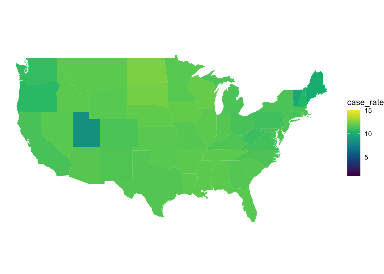
Figure 7: COVID 19 case rates in Novemeber.
We can see from the overall lighter colour of the map that from April to November that the number of cases has increased across the entire US. We can also see that there are differences between the states in April and some of these patterns persist into November. For example, we can see in November that North and South Dakota have some of the highest rates in the US whilst in April New York and Louisiana appear to have the highest rates.
ggplot(april_data, aes(x = long, y = lat, group = group, fill = death_rate)) +
  geom_polygon() +
  coord_map() +
  theme_void() +
  scale_fill_gradientn(colors = hcl.colors(10), limits = c(1,10))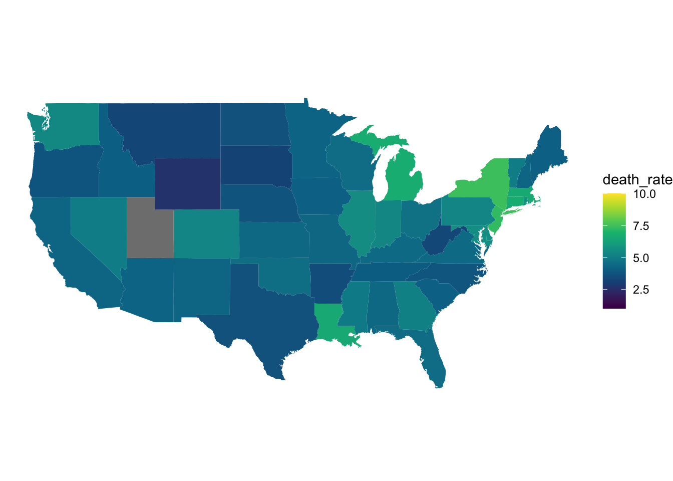
Figure 8: COVID 19 death rates in April.
ggplot(november_data, aes(x = long, y = lat, group = group, fill = death_rate)) +
  geom_polygon() +
  coord_map() +
  theme_void() +
  scale_fill_gradientn(colors = hcl.colors(10), limits = c(1,10))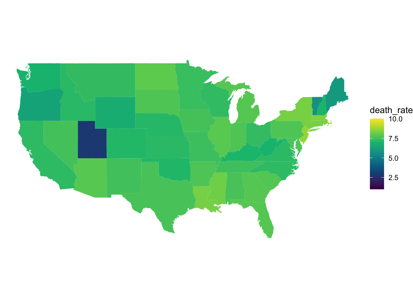
Figure 9: COVID 19 death rates in November.
When we look at the two death rate graphs above, we can see a similar trend to the case rate graphs we discussed earlier. In November, the death rates across most US states were higher than they were in April. We can also see in the April graphs, that states that exhibited higher COVID 19 case rates (New York and Louisiana) are also exhibiting higher death rates.
Conclusion
From the data shown above, we can clearly see that both COVID 19 cases and deaths have increased since April 2019 until November 2019 in the United States. We can also see that there are differences in case rate by state. If we wanted to extend this analysis further we could look to ascertain why rates differ across states.