
Heart disease prediction
TL;DR
Heart disease is a global health concern and the ability to accurately predict who has, and who does not have, heart disease is could prove very useful. In this analysis, we will use a number of metrics, and a range of machine learning methodologies, to predict whether a patient has heart disease.
Introduction
Heart disease is a leading cause of death globally. To determine whether an individual has heart disease a range of medical tests, including things such as an ECG, can be performed. However, it may also be possible to predict whether an individual based on a number of metrics. The analysis below will look to analyse a dataset with 13 explanatory variables to determine whether they can accurately predict whether an individual has cardiovascular disease. To begin with we will load in the data and then extract the column we are trying to predict using the code below.
heart_data <- read.csv("/Users/jonahthomas/R_projects/personal_blog/content/post/15-02-2021 heart disease prediction/heart.csv")
target <- as.factor(heart_data[, 14])
heart_data$target <- as.factor(heart_data$target)
heart_data <- heart_data %>%
  mutate(
    target = if_else(target == "1", "heart_disease", "no_heart_disease")
  )
Exploratory analysis
The dataset contains observations on 303 individuals. 0 in the dataset were diagnosed with having heart disease whilst 0 individuals did not have heart disease. The average age of the participants is 54.37 with 207 males and 96 females.
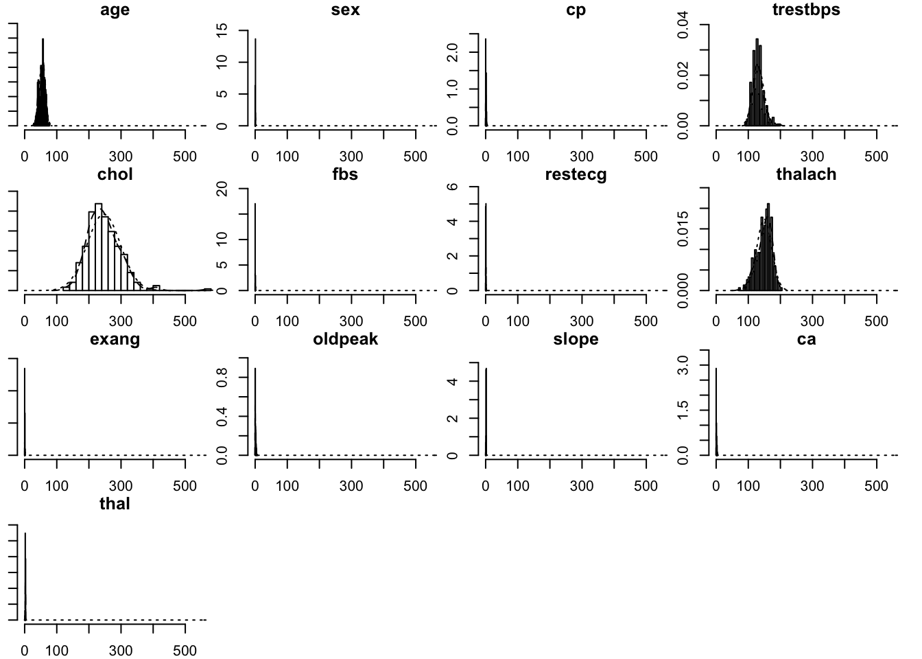
Below are histograms of all the variables in the dataset. These show the distribution of all the variables within the dataframe. Some, such as age, show a normal distribution whilst others such as cholesterol and thalach are left and right skewed respectively. This is not a major concern in this modeling process but it’s still a good idea to have a picture of how our data is distributed.
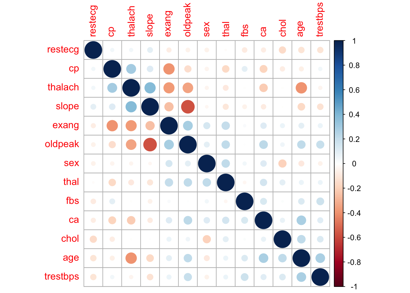
Next, we will plot the correlation between each variable in the dataset. This will give us an idea of the correlations between each variable in the dataset. We can see that the target variable (our response variable) has moderate to strong correlations with a number of variables. Of the explanatory variables, most are not correlated with each other however slope and oldpeak appear to be strongly correlated. Some models perform better with correlated variables removed but for this analysis we will leave all the variables in for now.
Differences between those with, and without heart disease
Before creating our models to predict whether an individual has heart disease or not, it is worth spending some time examining some key variables and understanding how they differ between these two groups. Firstly, we can look at age by creating a histogram and setting the fill variable to target.
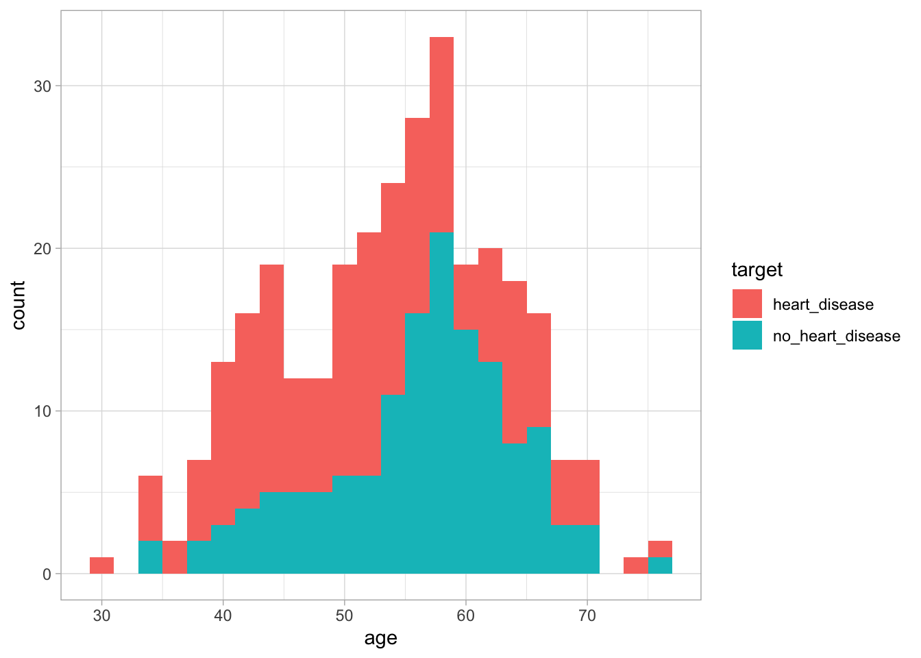
Figure 1: The distribution of age based on whether an individual has heart disease
We can see from this graph that there is no major difference in age distribution between the two groups. This suggests that using age alone we may not be able to differentiate between the two groups. Next, lets look at thalach. This variable looks at the maximum heart rate achieved during an exercise test. To do this, we will use the same methodology as before.
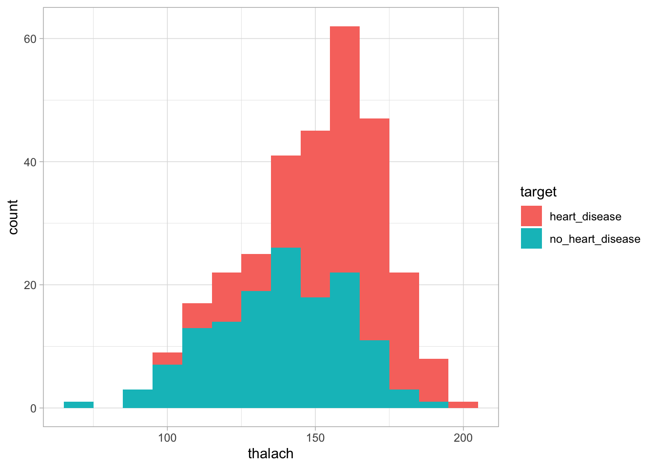
Figure 2: The distribution of cholesterol based on whether an individual has heart disease
We can see in this graph that the heart disease group appears slightly shifted to the right compared to the no heart disease group. This suggests that those with heart disease tend to to have a higher heart rate during the exercise test than those without heart disease. This suggests this variable may be useful in distinguishing between the two groups.
Whilst this methodology is useful, it would take a long time to perform such analysis on a large number of explanatory variables. Therefore, we could apply another methodology to determine the predictive ability of our explanatory variables.
Predictive ability assessment
To assess the predictive ability of each variable, we can start by working out the correlation between each explanatory variable and the response variable. If an explanatory variable is highly correlated with the response variable this indicates that as the explanatory variable changes so does the response variable. We can then use the filterVarImp function from the caret package to calculate the receiver operator curve (ROC) for each predictor. From this, two columns are returned representing the sensitivity and specificity for each variable. We can then use the mine function from the minerva package to calculate the maximal information coefficient (MIC). This metric is related to the strength of the relationship between the explanatory variable and the response variable and ranges between 0 suggesting no relationship and 1 suggesting a very strong relationship.
Finally, once we have all our metrics derived, we can bind them all together into one dataframe. I then sort the dataframe by correlation however each metric should be xplored separately as they only express slightly different information.
corrValues <- apply(heart_data[, -14],
                    MARGIN = 2,
                    FUN = function(x,y) cor(x,y),
                    y = as.numeric(target))


loessResults <- round(filterVarImp(x = heart_data[, -14],
                             y = target,
                             nonpara = TRUE), digits = 2)

micValues <- mine(heart_data[, -14], as.numeric(target))
micValuesDf <- cbind(corrValues, abs(corrValues), loessResults, micValues$MIC)
colnames(micValuesDf) <- c("Correlation", "abs_correlation", "sensitivity", "specificty", "MIC")
predictor_names <- colnames(heart_data[, -14])
rownames(micValuesDf) <- predictor_names
micValuesDf <- micValuesDf %>% arrange(desc(Correlation))
kable(micValuesDf, caption = "The importance of each explanatory variable in prediciting heart disease") %>%
kable_styling(bootstrap_options = "striped")| Correlation | abs_correlation | sensitivity | specificty | MIC | |
|---|---|---|---|---|---|
| cp | 0.4337983 | 0.4337983 | 0.75 | 0.75 | 0.2045989 |
| thalach | 0.4217409 | 0.4217409 | 0.75 | 0.75 | 0.2409894 |
| slope | 0.3458771 | 0.3458771 | 0.69 | 0.69 | 0.1168338 |
| restecg | 0.1372295 | 0.1372295 | 0.58 | 0.58 | 0.0240748 |
| fbs | -0.0280458 | 0.0280458 | 0.51 | 0.51 | 0.0005659 |
| chol | -0.0852391 | 0.0852391 | 0.57 | 0.57 | 0.1775380 |
| trestbps | -0.1449311 | 0.1449311 | 0.57 | 0.57 | 0.0944970 |
| age | -0.2254387 | 0.2254387 | 0.64 | 0.64 | 0.1244318 |
| sex | -0.2809366 | 0.2809366 | 0.63 | 0.63 | 0.0591383 |
| thal | -0.3440293 | 0.3440293 | 0.71 | 0.71 | 0.2132507 |
| ca | -0.3917240 | 0.3917240 | 0.74 | 0.74 | 0.1859573 |
| oldpeak | -0.4306960 | 0.4306960 | 0.74 | 0.74 | 0.2313734 |
| exang | -0.4367571 | 0.4367571 | 0.71 | 0.71 | 0.1422105 |
Whilst the table is interprettable with a small number of explanatory variables, it may become hard to interpret with a larger number. Alternatively, we could create a visualisation. Below, we create a horizontal bar plot showing the MIC of each variable. From this, we can see that thalach is estimated to have the most predictive ability. If we revisit the histogram we made earlier, we can then understand that the higher heart rate seen in patients with heart disease is the factor powering this relationship.
ggplot(micValuesDf, aes(x = reorder(rownames(micValuesDf), MIC), y = MIC)) +
  geom_bar(stat = "identity") +
  xlab("Variable") +
  coord_flip()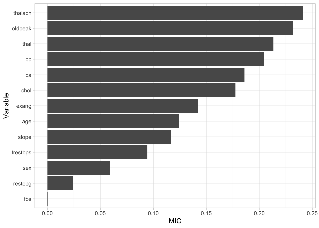
Figure 3: Variable importance
The steps above can be utilised to understand how our explanatory variables relate to our response variables allowing us to focus on variables with greater predictive ability. Due to the small number of explanatory variables in our data, we will continue our analysis using all the variables available to us.
Building some models
Now we have examined our data, we are going to build a basic model to use as a baseline to assess whether future models improve performance of our prediction.
Before we build any models we need to split our data into a training and a testing dataset. We will build the models using the train dataset and assess the performance of the datasets using the test dataset. To create these splits we will use the createDataPartition function from the caret package. Within this function, we set p to 0.8 to extract 80% of the rows included within the dataset. We will then use this row index to create an 80:20 train test split from our original data.
set.seed(123)
train_index <- createDataPartition(heart_data$target, p=0.8, list = FALSE, times = 1)
heart_train <- heart_data[train_index, ]
heart_test <- heart_data[-train_index, ]
train_target <- as.factor(heart_train[, 14])
test_target <- as.factor(heart_test[, 14])
Logistic Regression
To begin our modelling, we will create a logistic regression model to act as a baseline. To do this, we will use the train function from the caret package. We will use our training data and the associated target data as input. Then we will set the method to general linear model and the family to binomial to indicate we are wantting to classify a value with only two possible responses. Once we have created the model, we can use the predict function to use our model to predict whether a patient has heart disease. To do this we will provide the function with our model and the data we want to apply the model to. This will generate a list of prediction for patients included within our test dataset. Finally, we will use a confusion matrix to see how well our model predicted our response variable. We provide this function with our list of predictions as well as the actual values and the generated confusion matrix illustrates the accuracy of model.
set.seed(123)
log_reg <- train(heart_train[, -14], train_target,
                 method = "glm",
                 family = "binomial")

log_reg_predict <- predict(log_reg, heart_test)
log_reg_cm <- confusionMatrix(log_reg_predict, test_target)
log_reg_cm
## Confusion Matrix and Statistics
##
## Reference
## Prediction heart_disease no_heart_disease
## heart_disease 30 4
## no_heart_disease 3 23
##
## Accuracy : 0.8833
## 95% CI : (0.7743, 0.9518)
## No Information Rate : 0.55
## P-Value [Acc > NIR] : 2.959e-08
##
## Kappa : 0.7635
##
## Mcnemar's Test P-Value : 1
##
## Sensitivity : 0.9091
## Specificity : 0.8519
## Pos Pred Value : 0.8824
## Neg Pred Value : 0.8846
## Prevalence : 0.5500
## Detection Rate : 0.5000
## Detection Prevalence : 0.5667
## Balanced Accuracy : 0.8805
##
## 'Positive' Class : heart_disease
## The confusion matrix first illustrates whether our model predicted the correct response. We can see that 20 individuals without heart disease were correctly identified whilst 30 individuals with heart disease were also correctly identified. It also shows us that two individuals who had heart disease were misclassified using this model (these are known as type errors) whilst eight individuals with heart disease were incorrectly identified as not having heart disease (these are known as type errors).
The confusion matrix then provides us with a range of statistics that classify how well our model has predicted our data. Firstly, the accuracy statistics highlights our model is currently classifying 83% of patients correctly. After this, we can look at our kappa statistic which is an indication of the accuracy of our model but controlled for the chance of randomly predicting the correct outcome. Finally, we our provide with our sensitivity and specificity values. These values indicate … . Currently, we can see our model has high specificity but is slightly lacking sensitivity. Due to this, we will experiment with a number of other models to see if we can improve our predictive ability.
k nearest neighbour
The next model we will fit to our data is a k-nearest neighbour (knn) classifier. Explain model… . When we train our model, we supply the k value as 1:20 which asks R to create a 20 knn models using 1 up to 20 nearest neighbours. We can then assess the accuracy of each of these models using 5 fold cross-validation. For this data, the optimal number of k’s decided by R is 6, and this is the model we will apply to our test data.
set.seed(123)
knn <- train(heart_train[, -14], train_target,
             method = "knn",
             preProcess = c("center", "scale"),
             tuneGrid = data.frame(.k = 1:20),
             trControl = trainControl(method = "cv", number = 5))
knn_predict <- predict(knn, heart_test)
knn_cm <- confusionMatrix(knn_predict, test_target)
knn
## k-Nearest Neighbors
##
## 243 samples
## 13 predictor
## 2 classes: 'heart_disease', 'no_heart_disease'
##
## Pre-processing: centered (13), scaled (13)
## Resampling: Cross-Validated (5 fold)
## Summary of sample sizes: 195, 195, 193, 195, 194
## Resampling results across tuning parameters:
##
## k Accuracy Kappa
## 1 0.7441837 0.4796084
## 2 0.7359354 0.4636997
## 3 0.8100136 0.6124365
## 4 0.8023469 0.5973799
## 5 0.8269286 0.6453460
## 6 0.8230136 0.6392259
## 7 0.8390102 0.6699938
## 8 0.8225136 0.6357852
## 9 0.8141837 0.6185423
## 10 0.8265952 0.6441658
## 11 0.8105952 0.6099637
## 12 0.8144252 0.6179208
## 13 0.8225918 0.6341300
## 14 0.8269252 0.6437440
## 15 0.8186769 0.6264321
## 16 0.8105136 0.6107390
## 17 0.8023469 0.5929985
## 18 0.8065136 0.6017834
## 19 0.8023469 0.5929985
## 20 0.8145952 0.6173421
##
## Accuracy was used to select the optimal model using the largest value.
## The final value used for the model was k = 7.Decision Tree
The next model we will fit is a decision tree. Explain the model… . For our data, we apply the “ada” decision tree methodology however many other methodologies exist including C4.5 and C5 decision trees. We could also use a bagged decision tree… explain this… . Once again, the cross validation tests a number of tuning parameters such as the maximum depth of the decision tree as well as the number of iterations the tree goes through to build its decisions.
Support Vector Machine
Neural Network
set.seed(123)
nnet <- train(heart_train[, -14], train_target,
              method = "avNNet",
              preProcess = c("center", "scale"),
              trControl = trainControl(method = "cv", number = 5),
                  linout = TRUE,
                  trace = FALSE,
                  MaxNWts = 10 * (ncol(heart_train) + 1) + 10 + 1,
                  maxit = 500)
nnet_predict <- predict(nnet, heart_test)
nnet_cm <- confusionMatrix(nnet_predict, test_target)
Gradient Boost
set.seed(123)
gradient_lin_train <- train(heart_train[, -14], train_target,
                        method = "xgbLinear",
                        trControl = trainControl(method = "cv", number = 5))
gradient_lin_train
## eXtreme Gradient Boosting
##
## 243 samples
## 13 predictor
## 2 classes: 'heart_disease', 'no_heart_disease'
##
## No pre-processing
## Resampling: Cross-Validated (5 fold)
## Summary of sample sizes: 195, 195, 193, 195, 194
## Resampling results across tuning parameters:
##
## lambda alpha nrounds Accuracy Kappa
## 0e+00 0e+00 50 0.7730986 0.5404984
## 0e+00 0e+00 100 0.7690170 0.5322387
## 0e+00 0e+00 150 0.7690170 0.5322387
## 0e+00 1e-04 50 0.7773503 0.5489732
## 0e+00 1e-04 100 0.7855986 0.5656976
## 0e+00 1e-04 150 0.7773503 0.5491998
## 0e+00 1e-01 50 0.7440170 0.4821706
## 0e+00 1e-01 100 0.7525170 0.4983160
## 0e+00 1e-01 150 0.7485170 0.4905003
## 1e-04 0e+00 50 0.7773503 0.5489732
## 1e-04 0e+00 100 0.7855986 0.5656976
## 1e-04 0e+00 150 0.7773503 0.5491998
## 1e-04 1e-04 50 0.7773503 0.5489732
## 1e-04 1e-04 100 0.7814320 0.5576861
## 1e-04 1e-04 150 0.7773503 0.5491998
## 1e-04 1e-01 50 0.7440170 0.4821706
## 1e-04 1e-01 100 0.7525170 0.4983160
## 1e-04 1e-01 150 0.7485170 0.4905003
## 1e-01 0e+00 50 0.7605986 0.5166664
## 1e-01 0e+00 100 0.7567653 0.5085141
## 1e-01 0e+00 150 0.7608469 0.5163884
## 1e-01 1e-04 50 0.7647653 0.5247341
## 1e-01 1e-04 100 0.7567653 0.5085141
## 1e-01 1e-04 150 0.7691803 0.5325806
## 1e-01 1e-01 50 0.7648503 0.5238935
## 1e-01 1e-01 100 0.7689320 0.5316421
## 1e-01 1e-01 150 0.7689320 0.5310275
##
## Tuning parameter 'eta' was held constant at a value of 0.3
## Accuracy was used to select the optimal model using the largest value.
## The final values used for the model were nrounds = 100, lambda = 1e-04, alpha
## = 0 and eta = 0.3.xgblin_predict <- predict(gradient_lin_train, heart_test)
confusionMatrix(xgblin_predict, test_target)## Confusion Matrix and Statistics
##
## Reference
## Prediction heart_disease no_heart_disease
## heart_disease 28 8
## no_heart_disease 5 19
##
## Accuracy : 0.7833
## 95% CI : (0.658, 0.8793)
## No Information Rate : 0.55
## P-Value [Acc > NIR] : 0.0001472
##
## Kappa : 0.5578
##
## Mcnemar's Test P-Value : 0.5790997
##
## Sensitivity : 0.8485
## Specificity : 0.7037
## Pos Pred Value : 0.7778
## Neg Pred Value : 0.7917
## Prevalence : 0.5500
## Detection Rate : 0.4667
## Detection Prevalence : 0.6000
## Balanced Accuracy : 0.7761
##
## 'Positive' Class : heart_disease
## Assessing the models
Whilst the information above gives a very comprehensive summary of each models performance, it can be overwhelming. We can visualise some of this data using a four fold plot. This is a graphical representation of a confusion matrix and shows how each patient from the from the test dataset has been classified by each model. An example for each model is shown below.
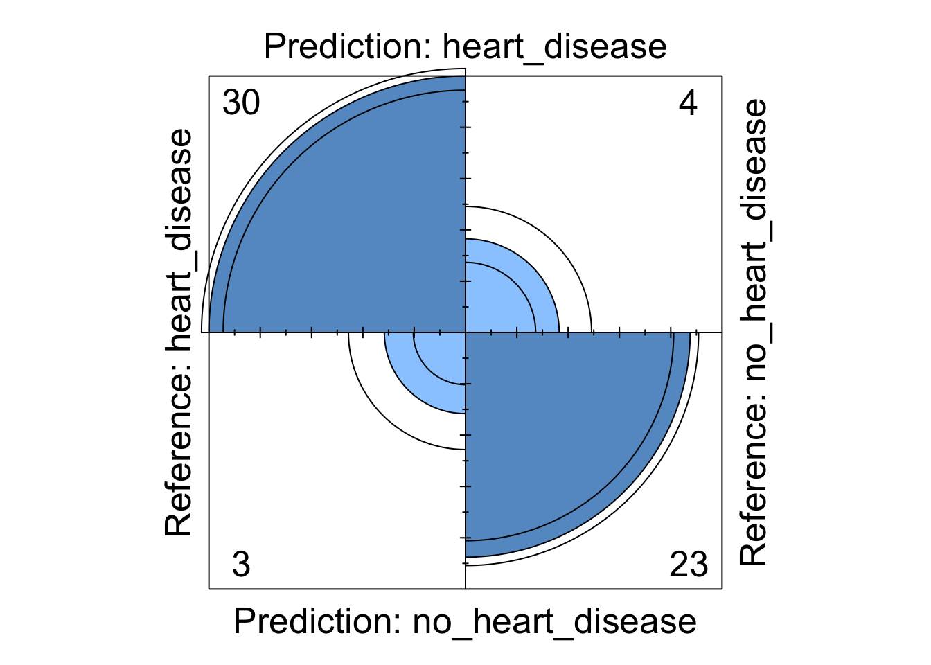
Figure 4: Logistic regression four fold plot
Figure 5: Decision tree four fold plot
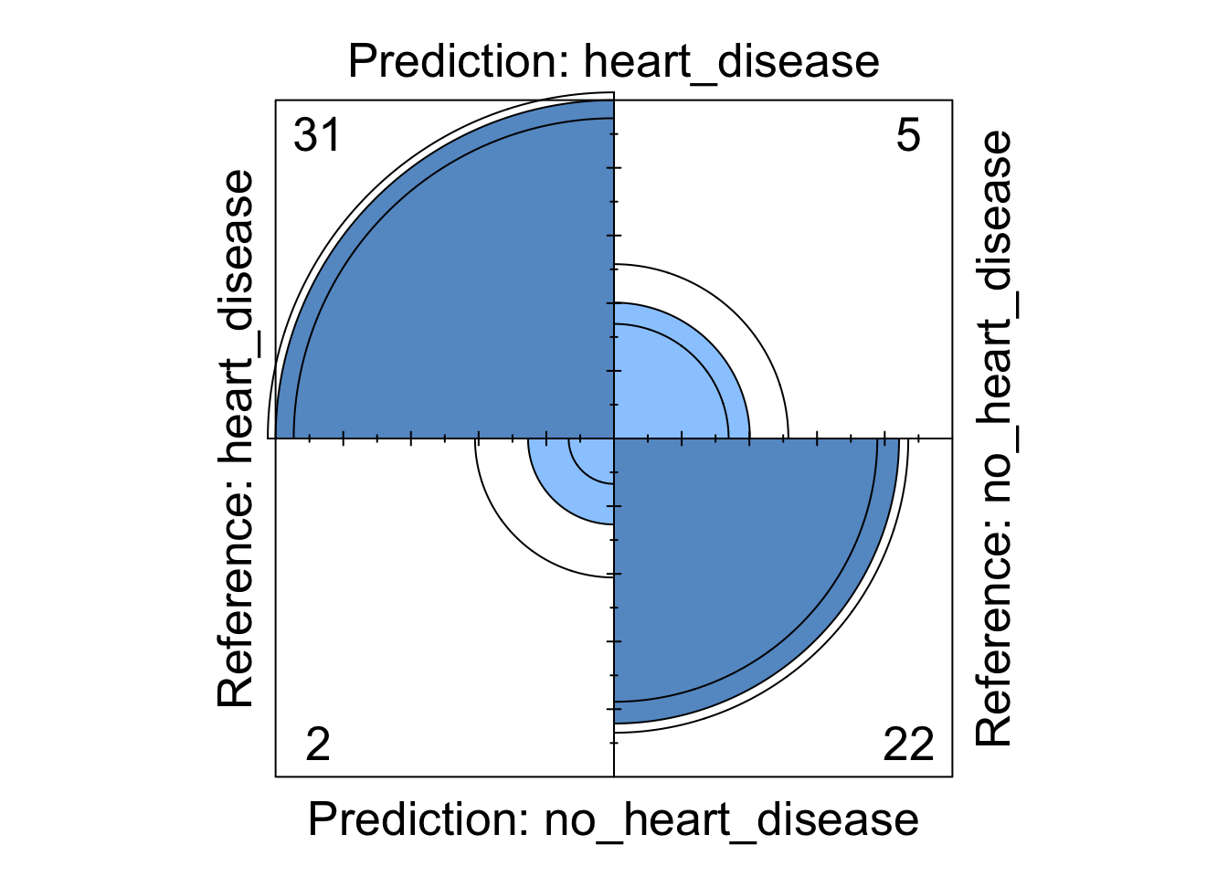

Figure 6: Support Vector Machine four fold plot
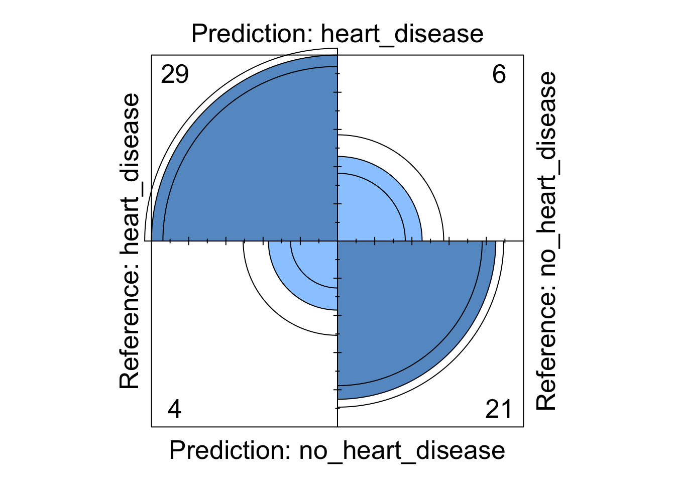
Figure 7: Neural Network four fold plot
We can see from these visualisations that all the models perform comparably well classifying the majority of patients correctly. However, depending on in which direction a patient is misclassified has a different impact in the real-world. If we take the logistic regression model as an example, we can see four patients are classified as having heart disease when they were not diagnosed with heart disease. This could present a number of issues in the real-world such as causing unnecessary panic to the patient as well as leading to potentially expensive further investigations. However in the same model, we can see that three patients who should have been diagnosed as having heart disease were incorrectly classified as not having heart disease. This is arguably much more problematic as these patients may not get the treatment they desire in a timely fashion and their condition could worsen. For this reason, in this example, it may be more desirable to chose a model that produces less type X errors even if this results in a greater number of total errors.
Conclusions
In the analysis above we have used a range of machine learning models to predict heart disease. We started by examining the data and assessing how the variables in the dataset explained the target variable. We then divided the data into a training and testing set, built our models on the training set and tuned some of the hyper parameters. We then assessed these models on the testing dataset and determined the performance of each model. To further extend this analysis, we could add weight penalties to the models to try and limit the number of misclassifications in a given direction.